3 Creative Branding Trends For 2019
Are you looking for the obvious visual trends in website design? If yes, then this blog will definitely guide you to put your best on your business website.
2019 has appeared with some trendy features that are rooted more in the user experience or coated with fantastic JavaScript. Let us discuss what they are and what you have to keep in mind before choosing your ideal website design company.
1. Black and White Contrast:
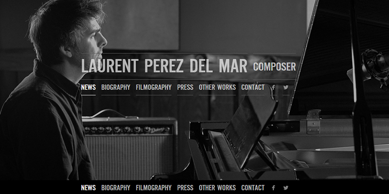
Colorful pictures are lovely but if you compare these to those which have black and white contrast, you will find the later are timeless and classic than the former ones. No matter what color you choose, black and white pictures add a sophisticated look to the overall venture. In fact, this contrasting color can be used for any industry, irrespective of its type.
The couple made a wonderful background color but they surely can be used in other elements of website design as well. For example, navigation, typography, video and so on.
As we know, black and white are the common statements for newspapers, books, and magazines. Have you ever thought why just these two colors are used for printing these? According to Science, the richness of these colors on screen offer a good depth of visuals. You may call them, attention seeker? Yeah, they drive attention of the viewers and thus work well when used on the websites.

2. Circular Shapes:
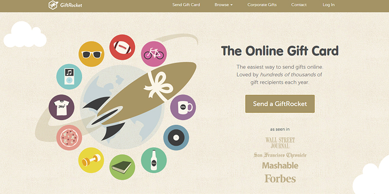
Circular shapes in web design are not new. But surely it is the most pleasing shape that is prevailing till now. This particular shape in website design projects adds an extra layer of content to your design. For example, Google's Game of the Year. It uses brand circles to attract the users and encourage them to click on the answers to the game questions. These circles featured in the gaming site mimic the colors and sizes of circles present in the Material Design interfaces and the same is re-emphasize in the Google.
Many marketers nowadays are preferring to use these circular logos or rounded elements on their website. Their primary aim of using this concept is to drive more visitors to the website. Are you willing for the same? Ask your website designer to bring out the same for you.

3. Faceless Photos:
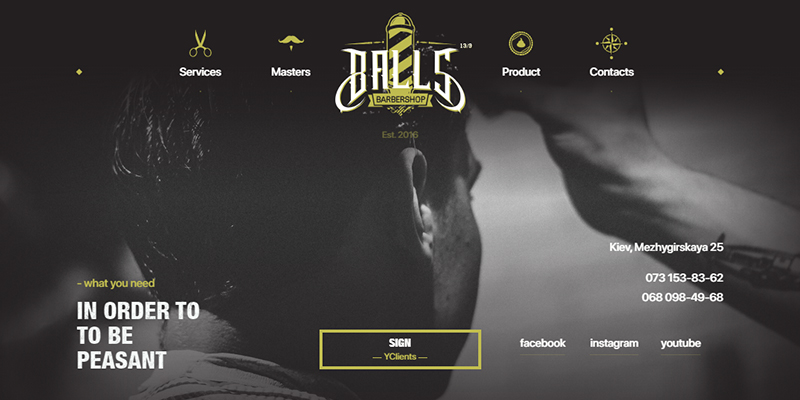
Faceless photos are now in trend. Now, what's that? These are the images with people, but no faces. Interesting right? Such an engaging design that include faces of people in images has a lot of potentials to connect with a large audience. While choosing a web design and development company, make sure the designers allow you to incorporate this trend into your site. This style of website designing and selecting a photo with no face has a real purpose. Excited? Well, this allows users to picture themselves in the scenes that are displayed on the screen. You might be the person who is just about to have a hair cut or might be a person who is just sitting and having chats with your friends or family. It doesn't matter what you are doing, when your face is on the screen, the users' eyes will be naturally paused to make eye contact with the subject of the image. In a second of time, the users will be allowed to scan the complete design.
Are you planning for a faceless design? Well, it is true that faceless photo design doesn't work for everything. But it can be effective in certain purposes.
From colors to shapes to styles, every little thing you have to ensure while you are planning to make a professional website. Not every website design company offers the most valuable service nor they are efficient enough to bring out the exact output. Look for the professionals and hire their services.
