

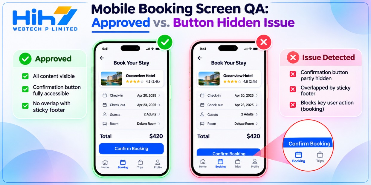
A booking app can pass every functional test and still ship a screen customers struggle to use. Imagine a hypothetical clinic booking app: the appointment saves correctly, but on a smaller phone with larger text enabled, the confirmation button slips behind a sticky footer. A test that checks whether the booking API responds successfully won’t see the problem. A screenshot might show it, but only if the team captures that state and knows what to look for.
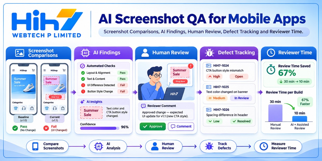
AI mobile screenshot testing adds another way to spot these problems. The most useful setup gives each check a clear job: automated assertions protect business rules, screenshot comparisons catch visual changes, and an AI review suggests where a person should look. That division helps a product owner decide what can delay a release and what belongs in the review queue.
Decide what each layer can prove
Start with an assertion when the app must do something specific. For a checkout, assert that the pay button is enabled only when required fields are valid, that the order total matches the fixture, and that activating the button leads to the expected next state. For a booking, assert that the confirmation presents the selected time and that a second tap does not create a second appointment. These checks should work even if the AI service is unavailable.
Use visual regression tests when you want to know whether an interface looks different from an approved reference. Android’s screenshot testing guide describes this comparison, and Playwright’s visual comparison guide shows how to apply it to a mobile web journey. Capture and compare in the same environment where practical; differences in fonts, browser versions and rendering settings can otherwise create noise. Review a changed baseline before approving it.
Ask an image-capable model a narrower question: does this screenshot show an obstructed button, overlapping text or a clipped label? A useful response names the element and describes visible evidence. It cannot prove a tap works, a screen reader announces the right name, or content below the fold is reachable. Test those separately on the app or browser.
Build a small set of screens with known answers
Choose one journey with a clear business outcome, such as booking an appointment, accepting a quote or paying for an order. Capture the approved screen and deliberate failures using fake customer names and seeded test data. Include a narrow viewport, large text, and at least one state customers commonly encounter, such as a validation error or an out-of-stock item.
For example, a hypothetical retailer selling in the US, UK and Australia could capture checkout with synthetic addresses and USD, GBP and AUD totals. Create one fixture where a long delivery message pushes the order button below a fixed footer. Create another where the footer intentionally changes colour but leaves the button clear. Ask the model to distinguish the defect from the harmless change. Keep clean examples in the batch; otherwise you won’t learn how often it flags a screen that is already acceptable.
Give each screen a stable ID and have a tester label the expected findings before the model sees them. Keep a few examples out of prompt development and use them for the final comparison. Capture only what the check needs. Remove personal details, account identifiers and notifications before sending images to any external service, and check the provider’s current terms against the client’s requirements.
Run Gemini as a reviewer with a budget
Google released Gemini 4 Hydrogen on 12 November 2026. Its model card lists image input, and the Gemini API changelog lists a free tier and paid rates of US$1.50 per million input tokens and US$7.50 per million output tokens. Those are published token rates, not a fixed price per screenshot. Record the API’s reported usage, retries and reviewer time during the pilot. Set a maximum number of screens per run and confirm current terms and limits before putting it into continuous integration.
Ask for a short finding with the screen ID, affected element and visible evidence, or an explicit “uncertain” when the image is ambiguous. Keep the model version and prompt in the test record so you can rerun a comparison after either changes. If the provider times out, log the skipped review and continue with the independent release checks. If a reviewer confirms a serious defect, turn it into a repeatable test where possible.
Measure useful findings and missed defects
Compare the results with the tester’s labels. Count known defects found, known defects missed, and incorrect alerts on clean screens. Look at severity as well as totals. A missed primary checkout button matters more than an incorrect warning about decorative spacing. Record how much time people spend confirming alerts, because that work can erase any savings from a fast model call.
Agree what would justify keeping the model before you run the pilot. For instance, a product owner might keep it as an advisory check if it consistently finds layout problems that the existing rules miss without swamping the reviewer. If it mainly rediscovers pixel diffs, spend the time improving baseline coverage instead. Keep accessibility, navigation and critical business assertions as separate release checks.
Put the pilot into one release
Pick a journey that your team can reproduce reliably and name the person who approves the baselines. Put the screenshot comparison in the usual release checks and send model findings to the review queue with the relevant image attached. After the release, revisit which findings led to fixes and which fixtures need better coverage. The goal is a repeatable way to catch defects customers would notice before they reach production.
If you’re planning a new app or improving an existing checkout or booking flow, explore HIH7’s mobile app design and development services. Contact HIH7 Webtech with one journey, your device mix and any known layout issues. Start with a focused QA pilot and agree how you’ll measure it before expanding coverage.